It's always a major step in the making of a conference when we agree with our friends at Bread and Butter on its visual identity. The design process includes usually quite a few hours of discussions of several iterations and synching all the feedback with our geographically challenged Lift team ;)
But here we go, the Lift14 poster is ready and we are all super excited to finally share it with you:
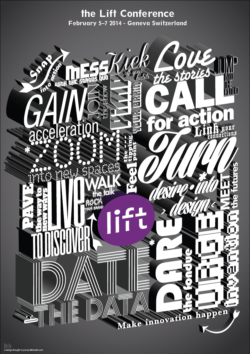
Here is a quick comment from Lift art director Laurent Bolli:
4-letter words to make a change: LIFT. This year's poster is based on 4-letter verbs, calling for action and urging to invent and engage with the future.
A compact compilation of 3D fonts, that is literally building a strong, solid, hybrid statement. We wanted the design of Lift14 to be impactful and without compromise. And we wanted it to connect with the idea of making real things happen at Lift.
We got inspired by the typography used in 30s-40s movies end credits (see here for some nice examples), but also by the big, wodden letterpress characters used in poster production until today.
4-letter words to make a LIFT, to DRAW a poster and to SNAP into action for Lift14.
Ps: Speaking of snapping into action for Lift14 in 4-letter words: It's time to GRAB your early bird ticket to MAKE sure you will JOIN the show and MEET the futures in 2014 :)